

Decadal forecast 2012
Outlook for global temperature in the next 10 years
Important
- Long-range forecasts are unlike weather forecasts for the next few days
- Forecasts show the likelihood of a range of possible outcomes
- The most likely outcome in the forecast will not always happen
- Forecasts are for average conditions over a wide region and time period
- For more details on interpretation, see How to use our long-range predictions
Decadal forecasts, also called 'near-term' climate predictions, range up to a decade ahead. Predictions account for natural variability and climate change as these are expected to be of similar size in many places. Forecasts are experimental, so at this early stage of development skill levels vary from place to place and for different variables. As a result, expert advice is needed to assess the reliability of regional predictions.
During 2012 our decadal prediction system was upgraded to use the latest version of our coupled climate model. The forecasts and retrospective forecasts shown here have been updated to reflect this change.
Forecast
Global average temperature is expected to remain between 0.28 °C and 0.59 °C (90% confidence range) above the long-term (1971-2000) average during the period 2013-2017, with values most likely to be about 0.43 °C higher than average (see blue curves in the Figure 1 below).
The warmest year in the 160-year Met Office Hadley Centre global temperature record in 1998, with a temperature of 0.40°C above long-term average. The forecast of continued global warming is largely driven by increasing levels of greenhouse gases.
Global annual temperature, decadal forecast
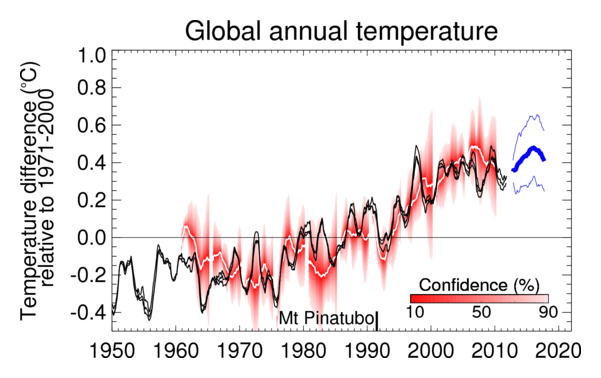
Figure 1:Observed (black, from Hadley Centre, GISS and NCDC) and predicted global average annual surface temperature difference relative to 1971-2000. Retrospective predictions starting from June 1960, 1965, ..., 2005 are shown as white curves, with red shading representing their probable range, such that the observations are expected to lie within the shading 90% of the time. The most recent forecast (thick blue curve with thin blue curves showing range) starts from November 2012. All data are rolling annual mean values. The gap between the black and blue curves arises because the last observed value represents the period November 2011 to October 2012 whereas the first forecast period is November 2012 to October 2013.
The following maps (Figure 2) show the difference between the predicted geographical distribution of temperatures over the period November 2012-October 2017 and long-term averages in °C. Diagram A is the most likely forecast outcome. Diagrams B and C indicate the range of forecast temperatures, such that we expect only a 10% chance of temperatures at a particular location being less than those in B, and only a 10% chance of temperatures higher than in C. Note that these ranges are for each individual location. The chances of these limits being met everywhere are very small, so the complete patterns shown in diagrams B and C are very unlikely to be realised.
Five-year mean forecast: mean, lower and upper estimates
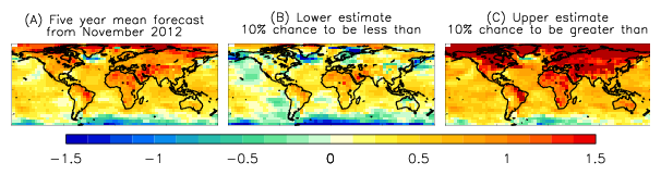
Figure 2:Forecast (A) maps of surface temperature differences (°C) relative to 1971-2000 for the 5-year period November 2012 to October 2017. Forecasts consist of 10 ensemble members starting from November 2012. The probable range is diagnosed from the ensemble spread, and shown as the lower (B) and upper (C) limits for each 5° grid box, such that there is a 10% chance of the observations being cooler than (B), and a 10% chance of the observations being warmer than (C). Note that the actual anomaly patterns in (B) and (C) are unlikely to occur since extreme fluctuations would not be expected at all locations simultaneously.
Verification
Retrospective forecasts have been made from numerous dates in the past. Some of these are shown in the top global annual temperature forecast figure (white curves and red uncertainty regions from 1960, 1965, ..., 2005). Generally, the retrospective forecasts predict rises in temperatures similar to those observed (black curve). Many facets of the variability, such as the record warming caused by the large 1997-1998 El Niño and the cooling caused by the 2008 La Niña, are largely within the range of the predictions (red shading).
The following maps (Figure 3) compare observed (A) and forecast (B) surface temperatures (°C) for November 2007 to October 2012 relative to the 1971-2000 long-term average. Forecasts were made starting from November 2007. Stippling shows regions where the observed temperatures do not lie within the predicted range (5-95%) of the forecast.
Observations and five-year mean forecast from November 2007
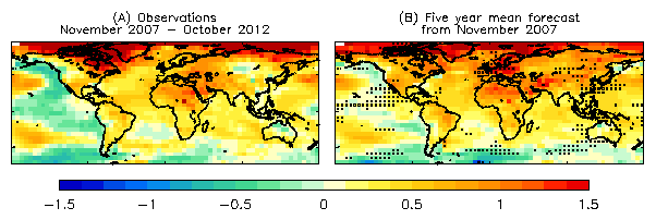
Figure 3:Observed (A) and forecast (B) maps of surface temperature differences (°C) relative to 1971-2000 for the 5-year period November 2007 to October 2012. Forecasts consist of 4 ensemble members starting from November 2007. The stippling shows where the observations lie outside the 5-95% confidence interval of the forecast ensemble.