
Tracking Regional Climate Change
Regional Climate Indicators Dashboard
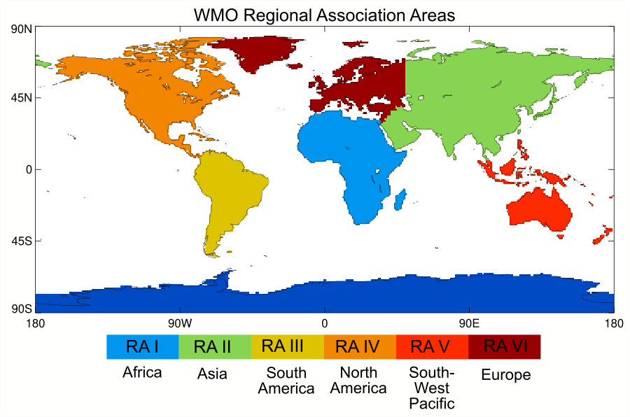
Although, global temperature tends to be a focus for reporting on climate and it holds an important place in the Paris Agreement, no one "experiences" the global temperature. Indeed, regional temperature changes can be quite different to the global mean. In particular, as noted in the IPCC Special Report on Land and Climate Change, land areas - where the majority of people live - have warmed faster than the global average. The plots shown here provide regional average temperature anomalies for the six WMO regional association. Region I is Africa, region II is Asia, region III is South America, region IV is North America, Central America and the Caribbean, region V is South-West Pacific, and region VI is Europe and the Middle East.
The time series are calculated from six different data sets. Four of these are "traditional" data sets based on data from weather stations, ships and buoys - HadCRUT5, NOAAGlobalTemp, GISTEMP, Berkeley Earth - and two are reanalyses, which use a weather forecasting model to combine data from a variety of sources - ERA5 and JRA55. Differences between the data sets are an indicator of uncertainty in our understanding of long-term regional temperature change.
The aim of the calculation, described below, is to get an annual area-average time series of anomalies (relative to the 1981-2010 average) of mean temperature for a specified region. Note that this process works for data that are already gridded (like those mentioned above).
Mean temperature is calculated in different ways in different countries. Sometimes this is the average of the maximum and minimum temperatures, but there are many other methods, including averaging hourly data. As long as a single method is used consistently, this is a secondary consideration. The processing steps for the gridded data are:
- Read in the gridded data set.
- Regrid the data to 1° latitude × 1°longitude resolution. If the gridded data are higher resolution, then take a mean of grid boxes within each 1°×1° grid box. If the gridded data are lower resolution, then copy the low-resolution grid box value into each 1°×1° grid box that falls inside the low-resolution grid box.
- For each month, calculate the regional area average using only those 1°×1° grid boxes whose centres fall within the region.
- For each year take the mean of the monthly area averages to get an annual area average.
- Calculate the mean of the annual area averages over the period 1981-2010
- Subtract the 1981-2010 average from each year

WMO RA I: Africa

WMO RA II: Asia

WMO RA III: South America

WMO RA IV: North America

WMO RA V: Southwest Pacific
