
Reliability and sharpness diagrams
Description of reliability and sharpness diagrams used to verify seasonal forecasts.
The terms 'reliability' and 'sharpness' used here have specialist meteorological definitions. For more details on reliability and sharpness diagrams please refer to the WMO SVS document and references therein.
Standardised Verification System for long-range forecasts
The ROC scores discussed in the previous section give information on the ability of the forecast system to detect the occurrence of a seasonal climate 'event'. Reliability diagrams provide additional information; they measure how closely the forecast probabilities of an event (e.g. European spring temperatures in the upper tercile category) correspond to the actual chance of observing the event.
Reliability diagrams
Reliability diagrams for temperature and precipitation forecasts have been prepared (see Global long-range model probability skill maps) for each geographical forecast region and for each class of event predicted (e.g. tercile or quintile categories).
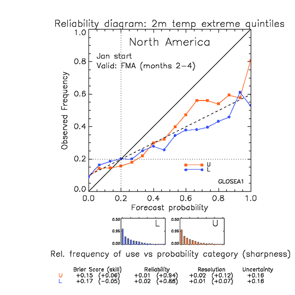
The above figure shows, for illustration, a typical reliability diagram. This is a realistic example, but not drawn from any current prediction system. The example illustrates verification of a set of forecasts (here, forecasts over a 16-year period), over a region (here, North America). The sample of forecasts included corresponds to all model grid-points over the region, over the verification period selected.
The reliability diagram groups the forecasts into bins according to the issued probability (horizontal axis). The frequency with which the event was observed to occur for this sub-group of forecasts is then plotted against the vertical axis. For perfect reliability the forecast probability and the frequency of occurrence should be equal, and the plotted points should lie on the diagonal (solid line in the figure). Thus, for example, when the forecast states an event will occur with a probability of 25% then for perfect reliability, the event should occur on 25% of occasions on which the statement is made.
In the figure the reliability curves have positive slope, indicating that as the forecast probability of the event occurring increases, so too does the verified chance of observing the event. The forecasts therefore have some reliability. However, the slope is less than the diagonal, indicating less than perfect reliability. In this example, when an upper-quintile temperature category has a forecast probability equal to 65% the actual chance of observing the event is closer to 55%.
The information contained in reliability diagrams may therefore be used to make approximate corrections to the forecast probabilities displayed in the forecast maps.
Sharpness diagrams
The sharpness diagrams show the relative frequency with which the event has been predicted (over the reference period and at all gridpoints) with different levels of probability. In the example the majority of forecasts predict low probabilities for the outer-quintile categories (lower probability than the climatological probability of 20%). The forecast system is also capable of predicting relatively high probabilities of the event (e.g. greater than 40%), but such forecasts are less common.
Forecast systems that are capable of predicting events with probabilities different from the observed event frequency are said to have 'sharpness' - and the forecasts in the example above thus exhibit sharpness. Corresponding diagrams for forecast systems with little sharpness would exhibit a frequency peak near the climatological frequency - indicating that the majority of forecasts predict the event with a probability near the climatological frequency. For planning purposes such forecast systems therefore offer little value over and above simple use of observed climatology.