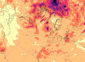
Probability forecast maps guide
Explanation of probability forecast tercile, outer-quintile and two-category maps.
For definition of categories and climatological period see
Tercile-category probability maps
Tercile categories have a baseline probability of 33.3% and by definition are expected to occur, on average, once in every three years. On the prediction maps, colour shading shows the forecast probability of the three categories in intervals of 20%. For both temperature and precipitation yellow and orange colours are used where the probability of a category occurring is enhanced above the baseline value (33.3%), while blue shading indicates regions where the probability of a category is depressed relative to the baseline value. White shading indicates that the probability is in the range 20%-40%, centred (approximately) on the baseline value of 33.3%.
Outer-quintile-category probability maps
Forecasts of the probability for outer quintile categories provide information on the likelihood of conditions more 'out-of-the-ordinary' than defined by outer tercile categories. Quintile categories have a baseline probability of 20% and by definition are expected to occur, on average, once every five years. On the maps, colour shading shows the forecast probability of the outer quintile categories. For both temperature and precipitation yellow and orange colours are used where the probability of the category is enhanced above the baseline value (20%), a probability of 40% implying a doubled risk of the event compared to the 'average' or baseline chance. White shading indicates that the probability is in the range 5-25%, here the probability of the event is near baseline or somewhat depressed. Blue shading indicates regions where the probability of a category is less than 5%, and thus the chance of the event occurring is less than 1 in 20, significantly lower than the baseline chance of 1 in 5.
Two-category probability maps
The maps show the probability of the three-month-average temperature/precipitation being above the climatological median. The probability of the three-month average being below normal is simply the complement, i.e. 20% probability of above normal is 80% probability of below normal. For the temperature charts, orange/red colours indicate highest probability is for warm while blue colours indicate highest probability is for cool. For rainfall charts orange/red colours indicate highest probability is for dry while blue colours indicate highest probability is for wet. Areas of white on the charts indicate probabilities are evenly balanced (between 40% and 60%), i.e. in those regions the likelihood of above-normal or below-normal conditions is similar.
View Global long-range model probability maps.
Note: Probabilities inferred for small regions by individual coloured squares may be unreliable. It is advisable to look at surrounding squares to get a picture of the overall pattern over a wider region.


