Global surface temperatures in 2017
January 2018 - Global temperature data from centres around the world show that 2017 was either the second or third warmest year on record.
Summary
- 2015, 2016 and 2017 are the three warmest years on record in a range of surface temperature data sets.
- Evidence from these surface temperature data sets is consistent with 2017 being either the second or third warmest year on record
- 2017 was the warmest year without the influence of El Niño and warmer than any El Niño year in the record prior to the 2015/16 El Niño.
- There is good agreement between data sets in those regions where the data sets overlap.
- Differences between the data sets in 2015, 2016 and 2017 are mostly due to how data gaps are dealt with, particularly the Arctic.
- The best estimates from all data sets agree that the Arctic was exceptionally warm in 2016 and 2017.
Drivers of recent global temperatures
The long-term increase in global temperature since pre-industrial times is almost entirely due to human activities. However, the increase in global temperature has not been smooth, with periods when warming was faster or slower and year-to-year changes. (Figure 1)
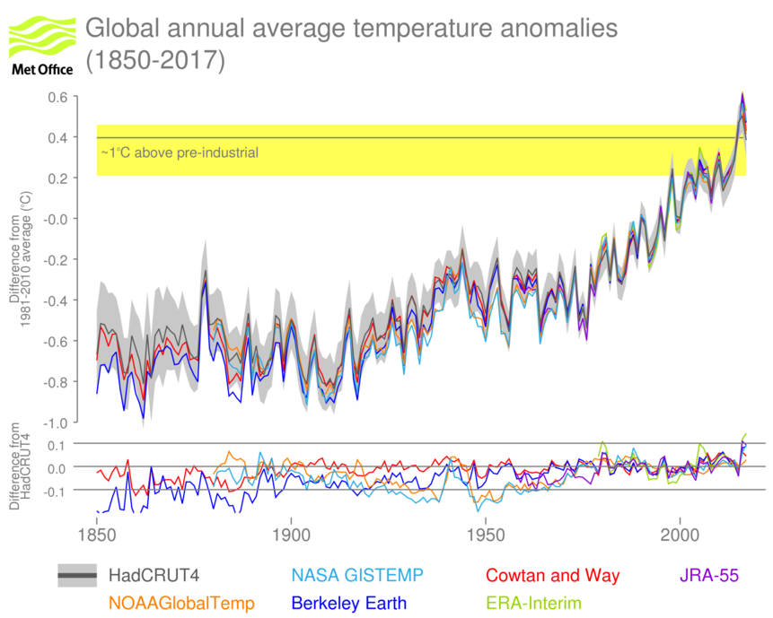
Figure 1 (top) Global annual average temperature anomalies (°C, relative to the long-term average for 1981-2010, 2017 to November). Six datasets are shown as indicated in the legend. The grey shaded area is the 95% uncertainty range for HadCRUT4. The horizontal grey line with yellow shading indicates the approximate point at which temperatures exceed 1°C above “pre-industrial” levels. The horizontal grey line is the difference from the 1850-1900 average. The yellow shading is derived from Hawkins et al. (2017). (bottom) differences of each data set from HadCRUT4 on an expanded scale.
One of the main drivers of year to year temperature change is the El Niño Southern Oscillation (ENSO). Cold currents driven by the seasonal winds and fed by deep ocean waters run along the western coast of the Americas and out along the equator. During warm El Niño events, the winds shift and the supply of cold water is cut off. As a result, sea-surface temperatures in the central to eastern Tropical Pacific rise. The heat released by El Niño events typically drives a short-lived spike in global temperatures, with the spike lagging a little behind the temperature changes in the Tropical Pacific. During cold La Niña events, the seasonal winds strengthen, the supply of colder water goes up and sea-surface temperatures drop. La Niña events are usually associated with cooler global average temperatures, but like El Niño the global effect usually trails a short way behind changes in the tropical Pacific.
2015 and 2016 saw weak El Niño conditions develop into a strong El Niño event – one of the three strongest of the past fifty years – which has since dissipated. The warming effect of the strong El Niño influenced global temperatures at the end of 2015 and the first half of 2016. This El Niño influence is the main reason why 2015 and 2016 (Figure 2) were clearly warmer than 2014. However, anthropogenic influences are necessary to explain the majority of the overall warming in the global temperature series.
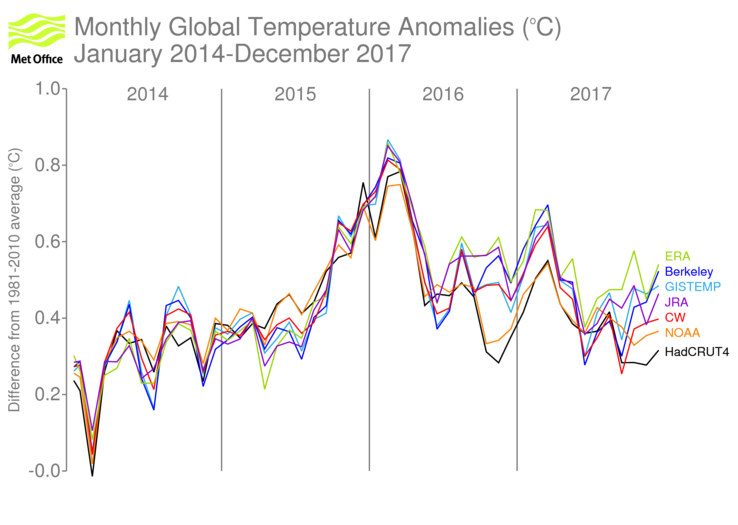
Figure 2 Monthly global average temperature anomalies (°C, relative to the long-term average for 1981-2010, 2017 to December). Five datasets are shown as indicated in the legend.
In 2017, there was a transition from neutral ENSO or weak La Niña conditions at the start of the year to La Niña conditions by the year’s end. (Figure 3) This transition was interrupted by a short lived event in which tropical sea-surface temperatures near the west coast of South America warmed to around 3°C above average for a short period. Unlike an El Niño, this event had regionally-limited impacts and quickly subsided. Because La Niña conditions didn’t appear until later in the year, their impact on global temperatures in 2017 is likely to have been rather limited. 2017 is the warmest year in the record without an El Niño and warmer than any year other than 2015 or 2016, whether it was influenced by El Niño or not.
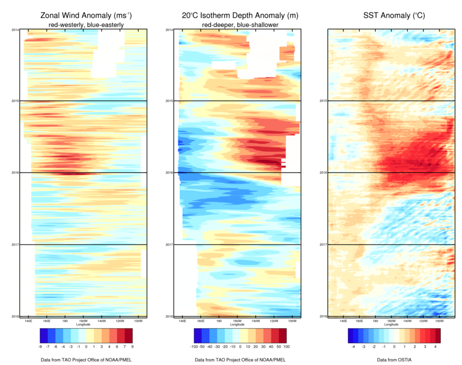
Figure 3 Differences from the long-term average of (left) zonal wind i.e wind speed along the equator, (centre) depth at which water temperature falls to 20°C and (right) sea-surface temperature across the Pacific between 5°S and 5°N. During El Niño events, the sea-surface in the eastern Tropical Pacific is warmer than average, winds blow more strongly from the west than usual and the layer of warm water near the surface thickens in the east. During La Niña the opposite occurs.
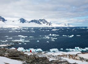
The Polar Regions also play an important part in understanding recent global temperatures. Sea-ice extent in the Arctic remained low throughout 2016 and 2017 (Figure 4). Areas of the high-latitude seas which would typically have been ice-covered in the climatology period were open water in 2017, a change that is often associated with increased temperatures. Although the area of the polar regions is only a small fraction of the Earth’s surface, temperature variations in these regions can be large and have an important effect on global temperature. Temperature anomalies in the Arctic in late 2016 and outside of the summer months in 2017 were exceptionally high (Figure 5). Long-term warming associated with greenhouse gases is expected to be greater at higher latitudes.
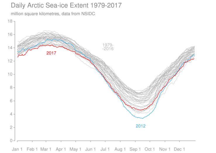
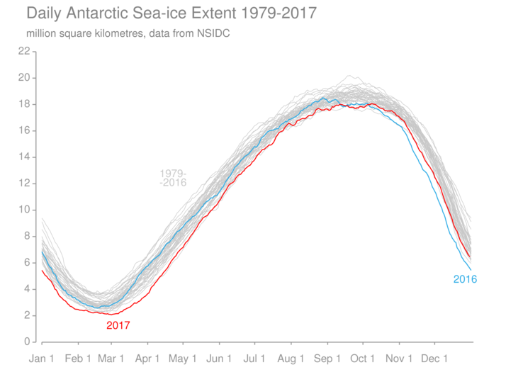
Figure 4 Daily sea-ice extent for the Arctic (top) and Antarctic (bottom) during the satellite record (1979-present). Individual years are shown in grey with 2017 highlighted in red. 2016 is highlighted in blue for the Antarctic. 2012 is highlighted in blue for the Arctic.
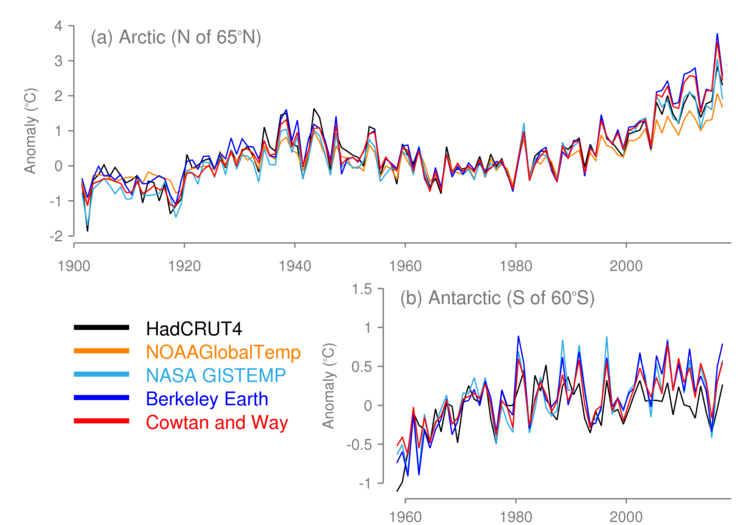
Figure 5 Annual average temperature anomalies (°C, relative to the 1961-1990 average) for the Polar Regions: (top) Arctic (North of 65°N) and (bottom) the Antarctic (South of 60°S). Note different temperature scales. 2017 to November. The Antarctic series starts in 1958, which is the first year of long-term routine measurements in continental interior.
Estimating global average temperature
Surface temperature data are gathered by a global network of weather stations, ships and buoys. This network measures air temperatures over land and sea-surface temperatures over the oceans. A number of groups use these data to produce global temperature data sets. The data are carefully processed to account for changing measurement methods and instrumentation, and for the uneven distribution of measurements around the world. The methods that the groups use are different and so the estimates of the global average that they produce are also slightly different.
In addition to traditional data sets based on surface-temperature measurements, there are atmospheric reanalyses, which use a much wider range of observations including satellite data in combination with a weather-forecasting model to produce a globally complete temperature analysis.
In general, the agreement between the data sets is very good. They all display a similar increase in estimated global average temperature over time and the short ups and downs in global temperature of around 0.1 to 0.2°C that signify the pulse of El Niño and La Niña can be clearly seen in each of the data sets. However, some differences are to be noted, particularly in the 19th Century where data are sparse and in the mid 20th Century when there were large changes to the way that sea-surface temperatures were measured.
We are focusing here on differences in 2015, 2016 and 2017, which can be seen more clearly in Figure 6, where the data sets fall roughly into two groups. One group, formed of HadCRUT4, NOAAGlobalTemp and CW, shows 2017 as cooler than 2015 and 2016. The other group, comprising GISTEMP, Berkeley, JRA-55 and ERA-Interim, has 2016 as quite a bit warmer than 2015 with 2017 in second place.
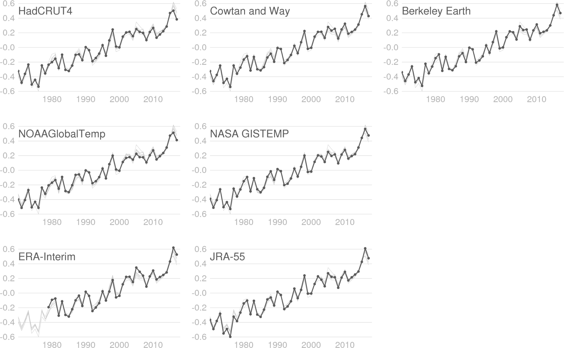
Figure 6 Global annual average temperature anomalies (°C, relative to 1981-2010) for each of the data sets (as labelled) from 1970 to 2017. The heavy, dotted line shows the dataset in the label and the fine grey lines show the other data sets for comparison. Data sets in the top row use HadSST3 for their SST data set. Data sets in the middle row use ERSST. The bottom row shows the two reanalysis data sets. Horizontal lines are spaced in 0.2°C increments.
Why are there differences?
One major difference between the data sets is the way they deal with geographically-uneven sampling. There is a difference in the degree of sophistication with which they attempt to fill gaps in the station network. All the data sets perform some degree of interpolation and the reanalyses are globally complete by virtue of using a global weather forecasting model. Of the traditional data sets GISTEMP, Berkeley and CW data sets do the most interpolation. HadCRUT4 and NOAAGlobalTemp estimates do less and when calculating a global average, they implicitly fill the gaps with the average for the rest of the world. Most importantly for the discussion here, they do not interpolate extensively into the Polar Regions which were particularly warm in 2016 and 2017.
In 2016 and 2017, the Arctic was exceptionally mild particularly during the Northern Hemisphere winter, autumn and spring. Annual temperature anomalies for areas north of the Arctic Circle (approximately 65°N) were nominally the highest on record in 2016, with temperatures around 2.0 to 3.5°C above the 1961-1990 average, and only slightly cooler in 2017. The Arctic average was considerably higher than the average for the rest of the globe so the data sets with sparser coverage in the Arctic will – all else being equal – tend to underestimate the global average temperatures in 2016 and 2017.
Between October 2016 and April 2017, temperature anomalies in the Arctic exceeded 5°C over wide areas and were above 10°C at certain times and places. Temperature departures in other parts of the world were generally less extreme. This combination was sampled differently by each data set and it led to a large divergence in estimates of the global average between October 2016 and March 2017. Both Arctic and Antarctic sea ice extent remained low in the context of the satellite record throughout 2017. Late 2017 also saw a large divergence between data sets, though the pattern is not as clear as it was in late 2016 with the spread between interpolated data sets covering much of the total range of estimates. This highlights the uncertainty associated with estimating temperatures in the Polar Regions.
The Arctic was also warmer-than-average in 2015, but the average anomaly here was much lower than in 2016 (by around 1°C). In addition, in the Southern Hemisphere, a strongly persistent pressure pattern of below-average pressure over Antarctica and above-average pressure at lower latitudes – which defines the positive phase of the Antarctic Oscillation – held sway over the continent during much of 2015. During the positive phase of the Antarctic Oscillation there is a tendency for temperatures across the continent to be below average. From January to September 2015, average temperatures across Antarctica were below the long-term mean, somewhat balancing out higher-than-average Arctic temperatures in the more heavily interpolated data sets.
How much difference does this make?
We can explore the size of the “coverage effect” by successively reducing the coverage of all the data sets to that of HadCRUT4, which performs the least extensive interpolation. In Figure 7a, we display the global average anomalies estimated from each of the data sets after first converting them to the same grid as HadCRUT4 – the same basic pattern can be observed as in Figure 1. Differences (Figure 7b) between global averages calculated from the data sets and HadCRUT4 exceed 0.05°C (the shaded region shows the ±0.05°C range) in a number of years, including 2016 and 2017.
Next, we reduce the coverage of each of the datasets to be the same as HadCRUT4 north of 60°N and south of 60°S (Figure 7c). This has the effect of reducing the differences (Figure 7d) such that even the largest differences between the five traditional data sets do not exceed 0.05°C. Finally, we reduce the coverage to be equal to that of HadCRUT4 across the whole globe (Figures 7e and 7f) which makes only a small additional difference. The residual differences when all the data sets are reduced to their common coverage are around one to four hundredths of a degree, thus indicating excellent agreement between them where they overlap.
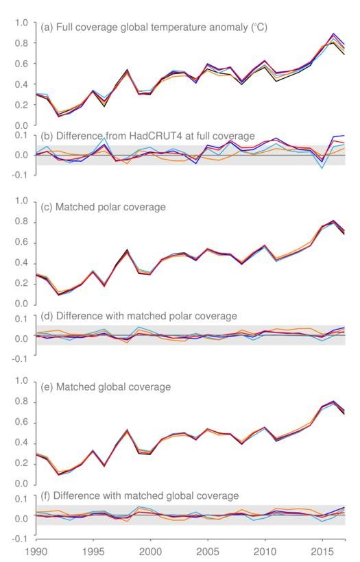
Figure 7 (a) Global average temperature anomalies for the five global temperature data sets at full coverage (HadCRUT4, Cowtan and Way, GISTEMP, NOAAGlobalTemp, Berkeley Earth) °C relative to the 1961-1990 average. Colours are as in Figure 1. (b) Differences between individual data sets and HadCRUT4. The grey shading is a visual aid to indicate the ±0.05°C range in the difference plots. (c) Global average temperature anomalies calculated from data sets matched to HadCRUT4 coverage in the Polar Regions. (d) Differences between individual data sets and HadCRUT4 after data matched to HadCRUT4 coverage in Polar Regions. (e) Global average temperature anomalies calculated from data sets matched to HadCRUT4 coverage everywhere. (f) Differences between individual data sets and HadCRUT4 after data matched to HadCRUT4 coverage everywhere. 2017 to November.
The small residual differences reflect the net effects of differing input data, and analysis choices. One recently-highlighted difference between the ways the data sets are processed is the choice of how they deal with changes in the marine observing system. HadCRUT4, CW and Berkeley handle it one way (using a method developed at the Met Office) and NOAAGlobalTemp and GISTEMP use another (developed at NOAA). Differences between sea surface temperature data sets are around a few hundredths of a degree when averaged over the global oceans, which is consistent with the size of the residual differences seen between the data sets here. Another difference to be taken into account is the choice of whether to use air temperatures or sea surface temperatures in ocean areas covered by sea ice.
An alternative way to think about the differences is to look at the uncertainty estimates provided with the HadCRUT4 data set (Figure 1). A large component of the uncertainty in the annual average is associated with limited coverage. Other uncertainties associated with local sampling and measurement limitations amount to around four hundredths of a degree, which is the expected size of the residual differences between data sets when disparities in coverage have been accounted for.