
Eagle-eyed weather watchers may have noticed some changes to some of the colours used in Met Office presented forecasts in recent weeks.
As part of a wider refresh on how we present forecasts across our channels, the slight tweak to colours used for rainfall intensity and temperature is being done for accessibility and consistency reasons.
Some people get red in the face on the topic of colour scales in weather forecasts, how they’re used, and how they change over time. So, this blog clearly lays out what we’ve done and why.
Evolution for Met Office colour scales
The refresh of the Met Office forecast for digital channels coincides with a minor shift in the colour scales that are used in both presented forecasts and through the app. This slight amendment to the colour scales used is being done for accessibility reasons and for more consistency.
As part of this change, the colours used for both rainfall intensity and temperatures in our presented forecasts are changing slightly.
The colours used for temperatures are the ones that are most often the subject of debate – and misinformation – online.
The most major shift in recent years to the Met Office colour scale for temperature occurred in 2019, with more shades of fewer colours used rather than different individual colours. This was done for accessibility reasons, with those who are colour blind able to better interpret shades of colour. This means shades of red at the top end of the temperature scales and shades of blue at the low end of the scale.
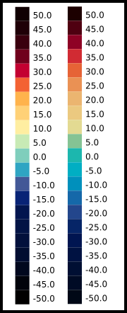
The above image shows the old temperature colour scale (left) compared with the new temperature colour scale (right).
An additional minor amend was made in 2022 in alignment with latest accessibility recommendations to ensure as many people as possible can understand the forecast.
Now a further slight tweak has been made at either ends of the temperature scale to enable clear communication around temperature extremes at either end of the scale, especially for those who are colour blind. This will also ensure more consistency in the colour scale used for Met Office forecasts available through the app, website, social media and presented forecasts.
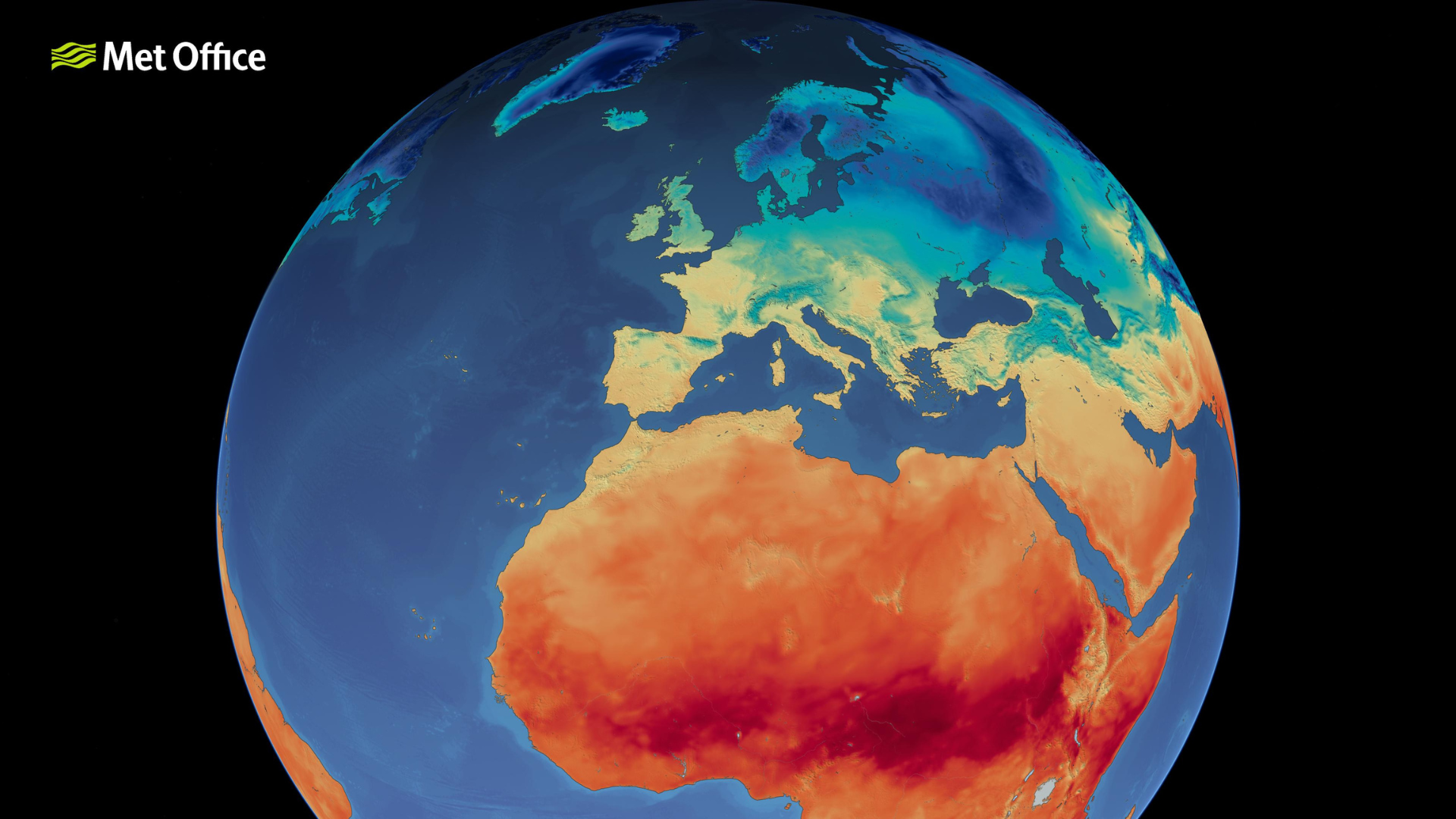
The map shows the new Met Office colour scale in use.
Met Office Presenter Aidan McGivern, who is colour blind himself, explained the changes: “Colour being used to communicate the temperature has been around almost as long as presented forecasts, but it hasn’t always been accessible to everyone. Many people who are colour blind have often struggled to interpret exactly what they’re seeing on screen and, as the UK’s national forecaster, it’s our responsibility to make sure as many people as possible can understand and react to the weather forecast.
“The latest change to the temperature colour scale is very minor indeed. As we often refer to severe weather events around the world, we have made the decision to have more shades of colours at either ends of the scale to enable better representation of temperatures experienced around the world. This change is consistent for both cold and warm temperature extremes and is more accessible for those who are colour blind.”
There’s a separate colour scale for displaying temperature anomalies, and this is also getting a tweak to include more categories and make it more consistent.
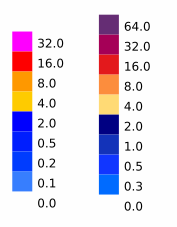
The old (left) and new (right) scales for rainfall intensity.
Has the temperature scale used changed due to climate change?
In short, no. The colour scale used by the Met Office remains static. It isn’t adjusted for individual forecasts to highlight or exaggerate conditions. People in the UK are most used to seeing temperature colours from around freezing to 25°C. If a temperature colour appears extreme, it’s likely because the temperature is extreme. Colours used for 35°C or 40°C aren’t used as frequently, so can appear more alarming.
As always, temperatures that appear in public Met Office forecasts are air temperatures. This is the reading of a temperature inside a Stevenson screen at a height of 1.25m above the surface.