What does this forecast mean?
Find out how to use Met Office forecast tables. This page explains our weather symbols and forecast data, which will help you get a more accurate reading of the forecast.
Date and time
The forecast table gives you an overview of the weather forecast at a specific location for the next seven days. We provide a long-range 28-day forecast for the UK as a whole, which you can find underneath the forecast table, below the map and flood warnings.
The time displayed in the table shows the forecast data for that specific moment in time, on the hour. So, for example, a ‘Sunny day’ symbol at 10:00am means that we expect there to be sun at 10:00am. If there is a ‘Heavy rain’ symbol at 11:00am on the same day, we expect it will start raining between 10:00am and 11:00am, and it will be raining at 11:00am.
Weather symbols
The symbols on the forecast are automatically updated every hour. We use the most recent observation data from across the UK and around the world. This helps to make the forecasts as accurate as possible.
Our 7 day forecast page also has regional information lower down the page. It is helpful to read this along with the forecast.
|
Clear night |
Sunny day |
Partly cloudy (night) |
|
Sunny intervals |
Mist |
Fog |
|
Cloudy |
Overcast |
Light rain shower (night) |
|
Light rain shower (day) |
Drizzle |
Light rain |
|
Heavy rain shower (night) |
Heavy rain shower (day) |
Heavy rain |
|
Sleet shower (night) |
Sleet shower (day) |
Sleet |
|
Hail shower (night) |
Hail shower (day) |
Hail |
|
Light snow shower (night) |
Light snow shower (day) |
Light snow |
|
Heavy snow shower (night) |
Heavy snow shower (day) |
Heavy snow |
|
Thunder shower (night) |
Thunder shower (day) |
Thunder |
Chance of precipitation
For example, a 70% chance of rain represents a 7 in 10 chance that precipitation will fall at some point during that period.
Chance of precipitation represents how likely it is that rain (or other precipitation: sleet, snow, hail, drizzle etc.) will fall from the sky over a certain time period.
Temperature
The number in the coloured bars represents the air temperature at that time in the units selected in Settings (Celsius or Fahrenheit).
Feels like
Feels like temperature takes into account wind speed and humidity to give a more representative indication of how the temperature will feel.
Temperatures in day tab
These are the forecasted maximum (highest) temperature for the day and the forecasted minimum (lowest) temperature at night. Day is from 9am to 9pm and night is from 9pm to 9am.
Sometimes the highest temperature for the day will be higher than the temperatures shown in the table. This is because it is the highest temperature forecasted to be reached that day. The hourly temperatures are the forecast temperatures at those exact times. This means that the temperature can be different at other times between those shown.
Wind direction and speed
The speed represents the average wind speed expected at that point in time, i.e. the mean wind speed you may encounter (in reality the wind will strengthen and lull constantly above and below this value).
The arrow shows the direction that the wind is blowing, and the letter represents the direction the wind is blowing from (on a standard 16-point compass rose).
For example, an arrow pointing upwards indicates a wind blowing from the south to the north, along with the letter S to indicate that it is a southerly wind.

NNW would indicate a wind blowing from the north northwest.
The Beaufort scale, is a measure for describing wind intensity. It is based on observed sea conditions, but is also used to describe wind conditions on land.
Wind gust
This value represents the highest wind speed that you should encounter at that point in time, as the winds peak, and then lull again.
Strong winds are shown in bold and represent speeds of 25 knots (or 29 miles per hour) or above.
Visibility
Visibility measures the distance at which an object can be clearly seen.
| Visibility index | Visibility in metres |
|---|---|
| VP (Very Poor) | Less than 1,000 metres |
| P (Poor) | Between 1,001 and 4,000 metres |
| M (Moderate) | Between 4,001 and 10,000 metres |
| G (Good) | Between 10,001 and 20,000 metres |
| VG (Very Good) | Between 20,001 and 40,000 metres |
| E (Excellent) | Greater than 40,000 metres |
Humidity
Humidity is the amount of water vapor in the air. If there is a lot of water vapour, the humidity will be high. The higher the percentage of humidity, the wetter it will feel outside.
UV
This is an index, developed by the World Health Organisation, called the 'Solar UV Index'. It shows the strength of the sun's ultraviolet (UV) radiation. The index is split into categories (Low, Moderate, High, Very High and Extreme). We have included advice about what you need to do to stay safe in the sun for each category.
| UV index | UV summary | Exposure category | Advice |
|---|---|---|---|
 |
No significant UV | It's safe to stay outside. | |
  |
 |
Low | You can safely stay outside. Consider sunscreen in direct sunlight. |
   |
 |
Moderate | Take care during midday hours and do not spend too much time in the sun unprotected. Sunscreen advised. |
  |
 |
High | Seek shade during midday hours, cover up and wear sunscreen. |
   |
 |
Very high | Avoid being outside or seek shade from 11am to 3pm. Shirt, sunscreen and hat are essential. |
 |
 |
Extreme |
Avoid being outside during midday hours. Shirt, sunscreen and hat essential. |
 |
|
No data |
Sunrise/sunset
Sunrise or sunset is the moment when the top of the sun’s orb is level with the horizon. This would be when looking at it from sea level with nothing in the way and with perfect conditions.
We do not use observational data because these results can be affected by:
- how high or low the observer is, compared to sea level
- whether there is something blocking the view of the horizon
- atmospheric composition, temperature or pressure
We use mathematical equations to work out the time of sunrise and sunset. These equations come from the Global Monitoring Laboratory. This means that you may see this moment at a slightly different time from the forecast.
Air pollution
The air pollution symbol shows the level of air pollution from pollutants such as sulphur dioxide, nitrogen oxides and particulate matter. This is taken from 'Daily Air Quality Index' defined by Defra, which is shows average concentration of pollution over a period of time.
The data shows average pollution levels for regions of the country. This means that there may be areas in the region with higher or lower levels of pollution than the average.
If you have a condition that puts you at risk from higher levels of pollution, please see our advice.
| Symbol | Category |
|---|---|
 |
No significant pollution |
 |
Low |
 |
Moderate |
 |
High |
 |
Very high |
|
No data |
Pollen
The pollen symbol shows the level of pollen in the air. We measure pollen levels across the country and work with other organisations, (like the National Pollen and Aerobiological Unit) to create a five day forecast.
The pollen count we show is for regions of the country. This means that the pollen count you see on a forecast is for the whole region, not the specific location.
You can get more information about the types of pollen in your region on our pollen forecast page.
| Symbol | Category |
|---|---|
 |
No significant pollen |
 |
Low |
 |
Moderate |
 |
High |
 |
Very high |
|
No data |
Pressure symbols
These pressure symbols are not used on our weather forecast table but you can see them on our Surface Pressure Chart page.
If you are interested to know more, please see our factsheets on air mass and weather charts.
 |
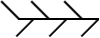
Cold FrontThe leading edge of an advancing colder air mass. Its passage is usually marked by cloud and precipitation, followed by a drop in temperature and/or humidity. |
 |
Warm FrontThe leading edge of an advancing warmer air mass, the passage of which commonly brings cloud and precipitation followed by increasing temperature and/or humidity. |
 |
Occluded front (or 'occlusion')Occlusions form when the cold front of a depression catches up with the warm front, lifting the warm air between the fronts into a narrow wedge above the surface. Occluded fronts bring cloud and precipitation. |
|
|
Developing cold/warm front (frontogenesis)Represents a front that is forming due to increase in temperature gradient at the surface. |
|
|
Weakening cold/warm front (frontolysis)Represents a front that is losing its identity, usually due to rising pressure. Cloud and precipitation becomes increasingly fragmented. |
|
|
Upper cold/warm frontUpper fronts represent the boundaries between air masses at levels above the surface. For instance, the passage of an upper warm front may bring warmer air at an altitude of 10,000 ft, without bringing a change of air mass at the surface. |
 |
Quasi-stationary frontA stationary or slow-moving boundary between two air masses. Cloud and precipitation are usually associated. |
 |
IsobarsContours of equal mean sea-level pressure (MSLP), measured in hectopascals (hPa). MSLP maxima (anticyclones) and minima (depressions) are marked by the letters H (High) and L (Low) on weather charts. |
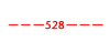 |
Thickness linesPressure decreases with altitude, and thickness measures the difference in height between two standard pressure levels in the atmosphere. It is proportional to the mean temperature of this layer of air, so is a useful way of describing the temperature of an airmass. Weather charts commonly show contour lines of 1,000-500 hPa thickness, which represent the depth (in decametres, where 1 dam = 10 m) of the layer between the 1,000 hPa and 500 hPa pressure levels. Cold, polar air has low thickness, and values of 528 dam or less frequently bring snow to the UK. Conversely, warm, tropical air has high thickness, and values in excess of 564 dam across the UK often indicate a heatwave. |
 |
TroughAn elongated area of relatively low surface pressure. The troughs marked on weather charts may also represent an area of low thickness (thickness trough), or a perturbation in the upper troposphere (upper trough). All are associated with increasing cloud and risk of precipitation. |
 |
Convergence lineA slow-moving trough, which is often parallel to the isobars and tends to be persistent over many hours. They are quite common in cold northerly outbreaks down the Irish Sea, affecting west Wales, Devon and Cornwall in particular, but can be found in other areas also. This convergence line can give hours of persistent precipitation over very localised areas, whilst a few miles down the road it is relatively dry, leading to some heavy snowfall/rainfall. In summer the convergence lines are not as easy to forecast, but then can still occur due to sea-breeze convergence, and are over the land, whilst in winter they are over the sea. |


Learn more about weather conditions and the UK climate with our factsheets.